
What you’re looking at there is a “mandelbulb“, a ray-traced rendering of a 3-D variant of the equation that generates the 2-D Mandelbrot set. The image you see in the post is a tiny one, 400×400, which pops up a larger 800×800 one when clicked. Both of these are just reductions of the 4500×4500 pixel version. I have a distinct… Read more →
Tag: visualization
More Spill Visualization
Today I ran into (over at PSFK) another extremely well-designedThe designer’s site is worth a peek as well. infographic that puts the current oil spill into context in a different way… Of course, this doesn’t really make me feel any better. Criminal charges might, though. Or I could find some way to help. Read more →
Visualizing The Problem
There is little I could say to add anything to the ongoing discussion around the horrible mess in the Gulf of Mexico–other than, perhaps, to point out that if BP had been required to have relief wells in place more-or-less immediately (as Canada requires) this problem would be resolved already. Those kinds of comments, though, don’t help resolve the current… Read more →
Matters of Gravity
What you’re looking at there is the sad and beautiful story of the death of two stars, and the casting of two other survivors into the darkness. I’ve been sitting here playing with the My Solar System gravity simulator since reading about it in Discovery–it’s a cool educational toy for modelling interaction of bodies under gravity. You can use it… Read more →
Utterly Thought-Stoppingly Awesome.
Watch this. Just watch it. Read more →
Aside
I love effective visualizations, and the Billion Dollar gram is a very simple and effective way to help normal people understand the relative sizes of some of the ridiculously large dollar values attached to various government, corporate, and public initiatives. As someone who enjoys data visualization I appreciate it. As a human being, I can’t get past that items across the top row without feeling a combination of almost blinding rage and terrible, terrible shame.
Stick Figure Crypto
I generally love when people use the comic form to explain complicated concepts. I generally love cryptography. I have a special place in my heart for stick figures. So you can imagine how I feel about Jeff Moser’s multi-stage explanation of how AES came about, and how it works. Everyone should check it out, since there’s not really anyone (at… Read more →
A continuous moving on
Have I previously discussed my enjoyment of the word flux? I don’t think I have. In fact, I like the word enough that I’ve just officially adopted it for the next year at Adopt-A-Word. As the word’s new guardian, I will, of course, be traveling the web to ensure the word is not misused, or under-used. (This is a charity… Read more →
Visualization And Facts
Are you familiar with GapMinder? It’s a great resource for visualization of all kinds of interesting data. One particular visualization that I’ve been thinking about lately is this presentation of life expectancy, average income, and population for several countries over time. It tells a primarily positive story about what’s been happening in the world over the last couple of hundred… Read more →
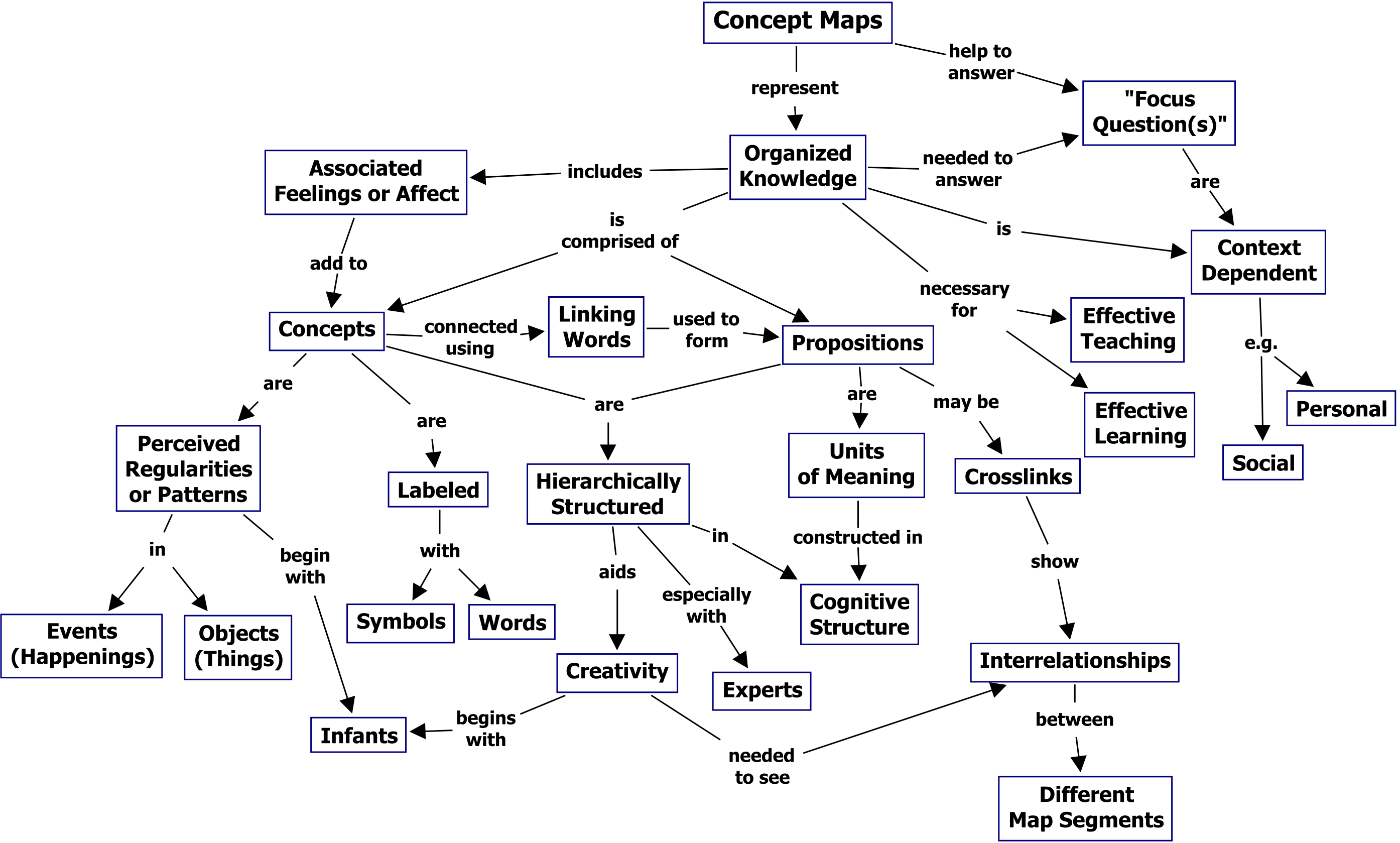
Aside
Today’s recursion giggle: a concept map of concept maps.
The Web is… um… big.
As I seem to be saying a lot this month, I’ve been using the Internet for a long time. I remember when Gopher was more useful than HTTP. I remember when with a little dedication you could surf a significant portion of the entire web. I mean, I’m not Berners-Lee or anything, but I started on the web about three… Read more →
Understanding Superstrings
“Hooray for popularization!” A while back I mentioned that I was really enjoying following the various TED Talks as they are being put online. (In fact, at this point, I’ve got an archive of over 230 of the talks as MP4 videos–around 12Gb–that I’m working my way through, either on the iPod during enforced waiting periods, or in my rare… Read more →
Professor Membrane Spotlight On: The Millennium Simulation
“Hooray for science!” Today we’re talking about the Millennium Simulation. I know this is an old story, dating as it does to 2005, but it’s got three different angles that appeal to my inner science geek plus a little something extra. You could start by reading a summary, or the Guardian article about the project, to get an idea of… Read more →
Lazy Sunday Links
So, last night we had a ridiculously out of season snowstorm, which dropped almost a foot of snow on us over night. Yes, I am writing this on Easter weekend. Yes, it is April. And yet still I saw this when I looked out the window this morning: The one upside of this is that I got to go out… Read more →
I love visualization
This is a representation of this web page: The legend is as follows: blue: for links (the A tag) red: for tables (TABLE, TR and TD tags) green: for the DIV tag violet: for images (the IMG tag) yellow: for forms (FORM, INPUT, TEXTAREA, SELECT and OPTION tags) orange: for linebreaks and blockquotes (BR, P, and BLOCKQUOTE tags) black: the… Read more →
