Are you familiar with GapMinder? It’s a great resource for visualization of all kinds of interesting data.
One particular visualization that I’ve been thinking about lately is this presentation of life expectancy, average income, and population for several countries over time. It tells a primarily positive story about what’s been happening in the world over the last couple of hundred years–in particular watch for the rising tide that starts around the 1950s.
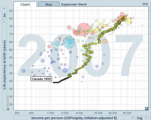
Picking out the data for Canada in particular, you can see a very positive story–essentially a continually rising life expectancy and average income as the years progress:

I wonder if there’ s any point in even thinking about extrapolations from that data–I mean we’ve got transhumanists and singularitarians predicting sudden booms in lifespan, and peak oil anti-globalists saying that we can’t keep growing wealth and that we’re heading for a population crash… still, the story for the last couple of centuries looks pretty good.
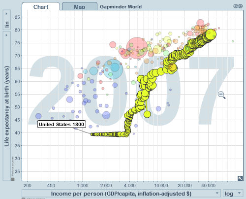
The American story is similar, although there there was a bit of a plateau in life expectancy early on, which is later caught up in an almost vertical line showing life expectancy leaping up while income stood still. In general once we get into the 20th century, the US is slightly higher in average income than Canada, and Canada is slightly higher in life expectancy:

Of course there are also some tragedies in there. Pick out Rwanda and watch what happens to that line over time to see what sheer human misery looks like in graph form.

