
There is little I could say to add anything to the ongoing discussion around the horrible mess in the Gulf of Mexico–other than, perhaps, to point out that if BP had been required to have relief wells in place more-or-less immediately (as Canada requires) this problem would be resolved already. Those kinds of comments, though, don’t help resolve the current problem; they just suggest things we can do to prevent this happening again.
I can, though, point out a few things that might help people really understand the magnitude of the spill–when you start talking about millions of gallons, in the context of an entire ocean, it’s hard to picture it. And when it’s all very far away, it’s easy to ignore it.
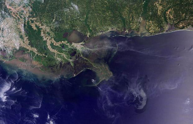
For most people, looking at something like this doesn’t really help you understand the magnitude of the problem:
So let’s try to first put the size of the problem in context: the people at IfItWasMyHome.com
So, if the spill were happening at my house, it would cover an area that would encompass all of the most populous parts of southern Ontario, and would also stretch into the US, essentially covering Buffalo and a good chunk of the U.P.

More disturbing is looking at what this spill would look like if it were happening in my former home of Halifax–the spill covers an area on the same scale as the entire province of Nova Scotia…

I’ll put a couple more examples after the jump, for places where I know some people who will read this are.
Maybe that’s helped with understanding the size of the spill, but what about the “if I’m not in Louisiana why should I care?” problem. We could discuss the ecological impacts, and the interconnectedness of ecology, etc. Or we could look at more direct personal reasons for people to care.
While the major media is just starting to really get interested in questions like “how will this effect Florida“, I think that’s actually a bit near-sighted, and I’ll show you a single image which I think explains why quite concisely–visualization to the rescue again:
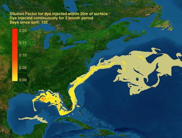
There’s another way visualization can help people understand the problem, of course, and it’s both simple and effective, and speaks perfectly well for itself.
Here’s the spill centered on Bisbee, Arizona:

And here it is over Melbourne, Australia:

