Now Magazine vs The Adapters

I’ve been following the video posts from the shooting of Scott Pilgrim vs The World, the movie that’s being adapted from Bryan Lee O’Malley’s series of Scott Pilgrim comics. Partly this is because I dig the comics, and it seems like the filmmakers are having a wonderful time adapting them, and partly it’s because Mal used to live here in HalifaxFor very generous values of “Halifax”–dude lived more the woods than I do, but I guess it’s all relative–he was an urbanite compared to say Darwyn Cooke, and was an occasional member of the HGPA, so naturally we’re all interested in this in a “what’s happening with his life” kind of way.

Anyway while watching the latest video, I noticed a particular prop, for reasons that are about to become obvious, that I think might illustrate the level to which the filmmakers are taking O’Malley’s work as a guide, and being loyal to its spirit. (If you’ve heard my previous comments on adaptations, the generally positive tone of this post might surprise you.)

Allow me to illustrate with three images.

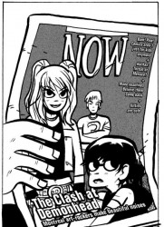
This is from a photo I just snappedI should probably have scanned it but that would involve moving all the crap I have piled up on top of my scanner at the moment of one of the pages of original art–I have a few of these in my collection–from the second Scott Pilgrim book. Because this is just a snap, you won’t really see all the blue pencil stuff that you could see under the inks in real life.

Original Art

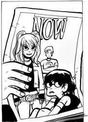
This is how the same page looks in the printed bookThe scanner is still covered, but the Internet being what it is downloading an illegal digital copy of the book took less time than it would to clean the scanner, and my conscience is free since I’ve bought that particular book like a dozen times.. The visible differences are really just the background colour and the text on the cover of NOW–whatever other post-production cleanup might have been done it’s not visual to a casual inspection.

Printed version

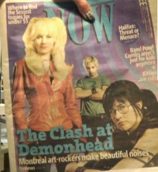
And this is an image I made by grabbing a couple of frames from that latest video blogthis, by the way, is why the bottom of the text looks weird–the angles didn’t quite match, and I’m not OC enough to worry about distorting the images to make them match showing one of the movie props:

Movie version

So yeah, if you were to judge from just this one data point, you’d say we’re looking at a pretty loyal adaptation. Hell the only thing they changed–adding the cheap, sexy toques bit–is perfectly in line with the spirit of the thing.

Of course you don’t have to judge by just that one data point–if you know the comics and are interested in the adaptation the check out the other stuff at the movie site. If you don’t know the comics, I can only recommend that you check them out–they’re pretty great.
Creative Commons Attribution-NonCommercial-ShareAlike 2.5 Canada
This work by Chris McLaren is licensed under a Creative Commons Attribution-NonCommercial-ShareAlike 2.5 Canada.