Yesterday was a marvelous mail day at the McLaren household. Through a confluence of mail karma–or possibly because our mailman seems to be skipping a day whenever he gets bored with the route–I had several books arrive from several different publishers. This will consequently be one long post full of book porn. If you’re not interested in small presses and finely constructed books, move along.
Let’s start with something a that will get me a bit of cred with the cool kids, before I proceed to blow it all by being fascinated with the content of geeky books, or even worse by the details of their physical construction
I think this might have arrived on the anniversary of the day I ordered it to the day. I didn’t order the book per se–I was one of the people who pre-ordered the whole fancy package of stuff before Amanda Palmer’s latest album came out
The book looks like this:
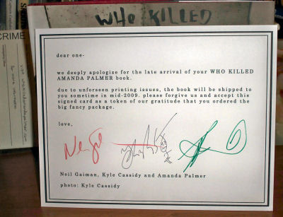
While I was utterly unbothered by the delay, the creators did feel bad about it, and send along a signed card to apologize.
The sentiment on that side is nice, the other side is a print of one of the images from the book:
Along with the book, and the card, there was also an envelope full of “crime scene photos” showing different AFP death scenes. I stuck the envelope in that little pouch to amuse myself, since it makes it look more “police procedural” to me.
Here’s an example of what’s inside the book, selected because I think it’s the funniest image in there:
I’ll certainly spend a lot more time listening to the music than looking at the book in the long haul, but there’s no denying it’s a lovely item.
And now for something completely different….
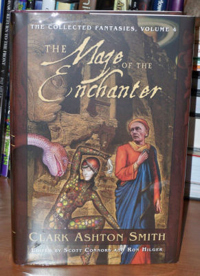
Today’s mail also brought me a package from Nightshade Books, which had the fourth volume (of a planned five) in their series of the fantasies of Clark Ashton Smith.
It’s been a while since the last volume, but for this kind of stuff that hardly matters–at the end of the day we’re talking about things you expect to have on the shelf for a lifetime, so what’s a year between friends?
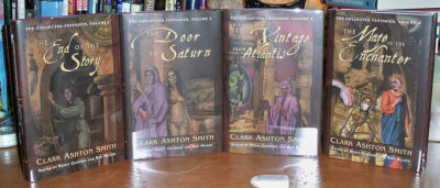
The new volume is as lovely as the previous ones, and they look great together, with the matching trade dress and illustration aesthetics:
However–and I realize that commenting on this will make you think I am utterly, hopelessly insane–if you line the books up on the shelf you will immediately notice that while the trade dress is consistent, this new volume has had a colour change in the title text from the expected white to the yellow that’s used for other design elements. This is the kind of thing that will drive me nuts every time I look at it–I mean, actually cause me phantom pain. I am not even going to try to pretend that’s normal
Now, speaking of things that don’t quite match when lined up on the shelf, we come to the next small press item to arrive:
Mike Resnick and The Reverend Lucifer Jones
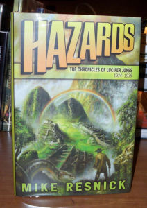
Yes, it’s the fourth volume of the adventures of Mike Resnick‘s Lucifer Jones, a character who’s approximately halfway between Flashman and Indiana Jones.
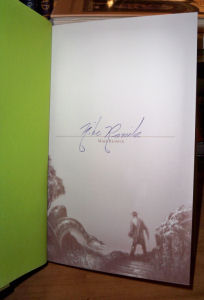
The book is up to the usual high standard of Subterranean Press editions, with a particularly lovely cover. Some of the design elements from the cover actually end up being reused inside on the signature page:
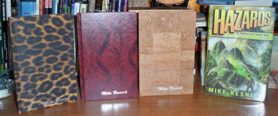
I’m glad to have this, since I quite enjoy the Jones stories, but perhaps moreso because this represents the continuation of something that’s being going on in my life for almost 20 years. The first small press, fancy editions of books that I ever added to my collection were the first three volumes of the Jones stories. I ordered them from Wildside Press back in the early Nineties, and I was stunned and fascinated to see the effort that John Betancourt put into producing those slim volumes–binding them in a series of unusual materials that fit with the milieu of the stories, to really make them stand out:
I thought those three early ones were the end of the road for Lucifer, but recently he’s made a comeback in the “pages” of Subterranean’s magazine. You can see the whole behind-the-scenes story and read the recent stories of the Reverend Jones there.
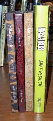
While I love the production values of the SubPress book, I almost wish that they had done something similar to those ancient Wildside editions–it would have been a cool bit of continuity. Still that’s a minor thing–mostly I’m delighted to have a new volume, even if the books don’t look related on the shelf:
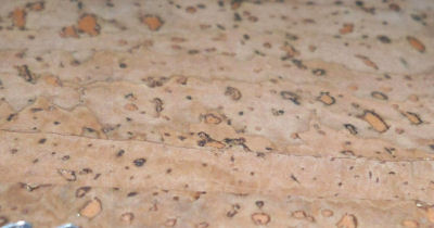
Oh, and yeah, that one volume–you’re seeing it right. It’s bound in cork.
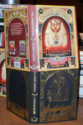
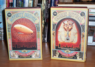
Our next package came from Amazon.co.uk, bringing me a lovely limited edition of George Mann’s latest Newbury & Hobbes story, from relatively new, but fascinating and feisty, publisher Snowbooks.
Lovely cover design there, eh? Again, really invokes the appropriate mood. Interestingly the cover design is also foil embossed into the boards of the books:
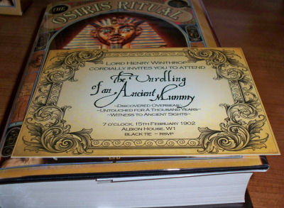
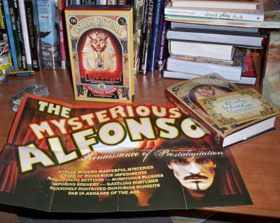
In addition to the slipcase, this limited edition comes with some extra materials, such as an invitation that one assumes relates to the contents of the story:
There’s also a period poster reproduction which probably also ties in.
I also think Mann has one of the nicest signatures in the field.
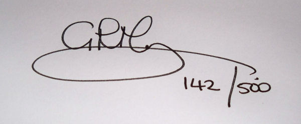
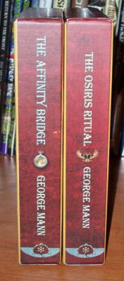
In addition to containing what I expect to be a great story, and being a nice physical object on it’s own, it also nicely matches with the similar edition of the first Newbury & Hobbes story:
No issues with shelf appeal here–lovely design work:
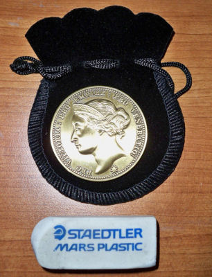
By the way, that first one also came with some paraphernalia. In this case a special coin in a tiny pouch–shown here with something we’re all familiar with for scale:
The front side there is quite lovely. The back side is a little more marketing-y, but does replicate design elements from the book cover.
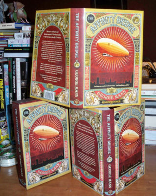
The kids at Snowbooks must have liked that cover design as much as I do, since it’s replicated on the slipcase, the dust jacket, and again on the boards of the actual book (no foil embossing here).
Which brings us in turn to two items that came in the big box–the items I ordered from Centipede Press during their recent sale in July. We’ll start with the smaller one first
I’ve been a fan of Brown’s since I first got a collection of his science fiction and fantasy shorts from the SFBC as a young teen. The stories were all pretty sure, but many made a lasting impression. This lead to my buying NESFA’s larger collections, and now has lead to my starting to explore some of his works in other genres.
I’ve got a lot of faith in Centipede, so picking up a Brown book from them seemed like a good plan, especially when I was teased with the original cover image and the notion of a whodunit carnival story.
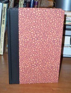
The Centipede book doesn’t actually look like that though–it looks like this:
You probably can’t tell from that photo, but the crazy pattern on the boards is actually textured. Check it out:
While the pattern is a bit crazy, the book looks pretty staid on the outside–quarter bound in leather, with patterned boards feels conservative…
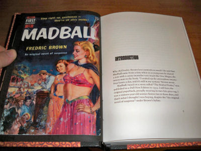
..and then you open the book and see this:
That original cover is actually reproduced with the introduction (there’s also a second pulp cover shown in there are well):
I expect this will get read pretty soon. Carnival story, you know?
That brings us to the other Centipede volume. It needs some introduction, since it’s the end of chain of purchases.
It all started with Falling Angel–between Crumley’s recommendation and the descriptive text, I knew I had to get that book, my first purchase from Millipede, once a distinct imprint from Centipede.
I liked that quite a lot, which lead to my digging around in Millipede’s catalog. Which lead to Centipede. Several Centipede books looked nice to me, but they were pretty damn expensive. I suspect I wouldn’t have ever ordered anything from them… except that they got Gene Wolfe. And man, I love Gene Wolfe.
So I ordered the first Book Of The New Sun volume from Centipede, with some pretty serious trepidation about dropping that much coin. And you know what? When that book arrived all worry evapourated–it’s ridiculously lovely, worth every penny and then some. I will happily continue to pay for the rest of the books in the series as they are produced.
This lead to increased confidence in Centipede, which made it possible for me to break down and order their Algernon Blackwood collection–the first title in their Masters Of The Weird Tale series–and later to take advantage of a sale to pick up their book of art inspired by H. P. Lovecraft.
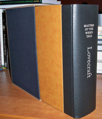
And that, in turn, lead to me breaking down and ordering another of their Masters Of The Weird Tale volumes, this time the Lovecraft one, as part of the July Sale.
Lovecraft
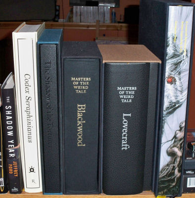
Here you can see the new Lovecraft volume sitting along side some other Centipede books–with Jeff Ford thrown in there for scale, since these books are really big.
This Lovecraft collection is not just tall, but it’s thick. A scientific experiment shows the slipcase to be as wide as six randomly selected paperbacks from a nearby stack:
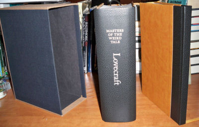
When pulled out of the slipcase, the book has boards covered with ridiculously supple leather. I wish I had a coat made of that.
The slipcase actually contains two volumes: the huge volume of stories, and a thin volume of photographs, both of which are similarly bound. The photograph volume is split roughly in half between contemporary photos of Lovecraft, and modern J. K. Potter photographs of the kind of spooky New England that qualifies as Lovecraft country.
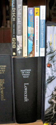
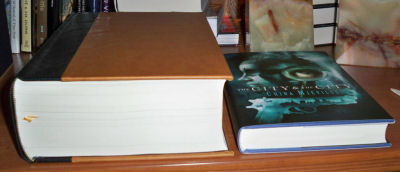
Since I just can’t get over the size of this book, here’s another image for scale. It looks like the Lovecraft is about to snap up the Mieville in one bite.
Here’s the title page of the book–there’s a protective page there separating the photo from the actual title page.
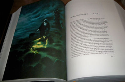
Here’s something form the inside showing the kind of illustrations that fill the book, and the kind of layouts that are used to present the stories. I actually really like the layouts that Centipede uses–the whitespace and font selection create a real sense of “readability”, if there is such a word.
If I were a font nerd I could probably identify this font immediately. I’m not, so I can’t, but it’s sure easy on the eyes.
Here’s a photo from the first part of the photo book. Note that the photos are on heavy black pages, with protective sheets between each page.
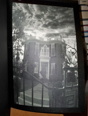
And here’s one of the Potter photos the second part of the book
And that wraps up the various books that arrived together this week… but not the book porn, since I just need to add one other little item that I got my hands on this week:
Darwyn Cooke
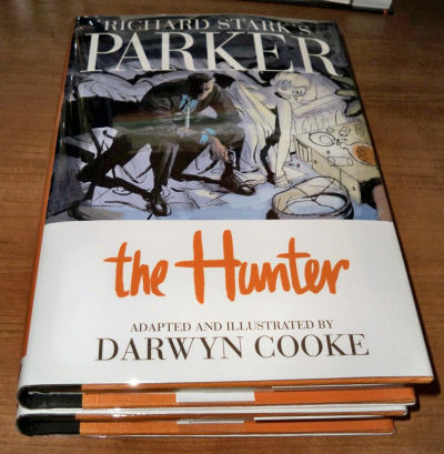
If you have any interest in comics, or in the hard-boiled writings of Richard Stark (a.k.a. Donald Westlake) you’ve probably heard of Darwyn Cooke‘s adaptation of Stark’s Parker books to comics, the first of which shipped to stores this month. The reviews have been many, and almost uniformly strongly positive.
The books looks like this:
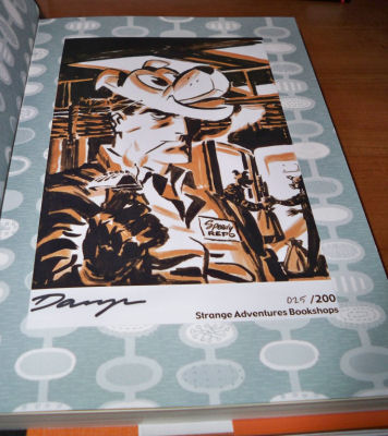
Since Halifax is more-or-less Darwyn’s town now, he provided Halifax’s first class comic shop, Strange Adventures, with bookplates with some art, signature, and a limitation.
These books were intended to be something special for the locals, but I think there might be one or two of them left, so you could try to get in touch with Strange Adventures (they do mail order) to see if they’ll sell you one now that the locals have had a chance.
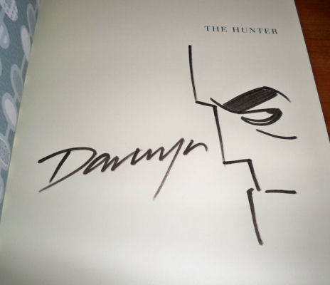
Late last week there was a launch party for the book (also sponsored by Strange Adventures), and Darwyn did some signing and sketching for people there, so I got a second modification done to my copy:
So, with all these lovely books coming in this week, what am I going to read tonight?
Actually, none of them…
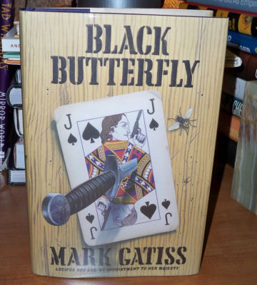
Tonight’s reading will be the newly arrived third Lucifer Box novel from Mark Gatiss.
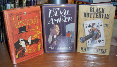
You can see it here with the previous ones (that first one isn’t shopworn–it’s one of those books where the jacket is printed with the image of damage on it; it’s cute, but it drives me nuts), which were both great fun.
(There was a comic adaptation of the first one, but the novel is better. Even better than that, though, is the audio version performed by Gatiss–hearing Box’s narration in his own voice is the perfect thing.)
And with that, I’m off to spend some quality time with the now elderly louche.















2 comments for “Book Porn”