Have you noticed I talk a lot on this blog about my weekly poker game? This is some more of that–I should make a category for this so people can skip these posts if they don’t care.
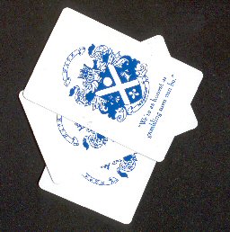
What you’re looking at there is a scan of some playing cards featuring the crest & slogan of the Halifax Gentlemen’s Poker Association that one of the lads (“Pogey Mike” when we’re feeling mean, or “the Warden” when his stock is up) brought to this week’s game.
Let me explain:
Back in September last year we decided we needed a group mailing list, so that we could easily discuss the “where/when stuff” among the set of loose members of our game (there are around 12 or so regulars, with another 5 or 6 peripheral people who show up occasionally). Being the deepest computer nerd in the pack, I set that up using the “group” stuff on Yahoo. (Yahoo.ca actually, since we are Canadians).
When I was setting up the group, I needed to supply a name for the list. I figured it should be something short, so that the email address was easy to remember. On a whim I decided we would call it the Halifax Gentlemen’s Poker Association (yes, I realize this name sort of excludes Kathy_8s, but I think that’s kind of funny–she’s one of the guys anyway), and used the HGPA acronym for the list address.
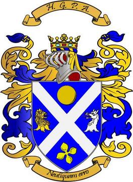
Well, once I had that name in mind, it just seemed like there should be a little more in the way of posh accoutrements to really run with the whole “gentlemen’s club” gag. So I did a little bit of quick reading on heraldry, and a little bit of Photoshop work with some common heraldric elements, and came up with a crest for the association:

Here’s the scoop on the elements of that crest:
“Neutiquam erro” is Latin for “I am not lost”, which seemed the most appropriate of the list of common Latin mottoes I was working from. Never give up, no matter how short your stack is.
St. Andrew’s Cross, or Saltire: This is the blue background with the white cross, and it represents resolution–which is sometimes quite key in poker. It also represents Scotland in these colours, and by extension Nova Scotia. (See the flag of Nova Scotia)
Wolf: Reward from perseverance in long sieges and/or hard industry. This is also quite appropriate for poker.
Roundles (Gold or yellow)–the yellow circle thing: This is actually a representation of bezants or byzantine coins and indicate someone worthy of trust or treasure. Between the high level of bluffing, and the movement of cash, at our games, this also seems pretty appropriate.
Quatrefoil (Primrose)–the four-leaved thing at the bottom: In heraldry this is said to represent or brings good tidings. You really can’t have a crest for a poker group that doesn’t reference luck in some way, right?
Lion: Dauntless courage. This mostly refers to what you need to either stone cold bluff a pot, or to follow your instinct into the face of someone who is representing a better hand.
Of course, in addition to a crest and a motto, the group also needed a slogan. That one was provided by adapting a line from a classic source, giving us the slogan “We’re as honest as gambling men can be”.
These things have been a little joke among the group, and apparently Mr. Ward is running with the joke, as he had several decks of the custom cards pictured at the start of this post made up.
Now I’m going to have to see how much it would cost to get some custom shirts made. I think it would be terribly hilarious for all of us to descend on the casino in our HGPA shirts. Especially if the players are as utterly without skill as Neil reports they are.


2 comments for “H.G.P.A.”