
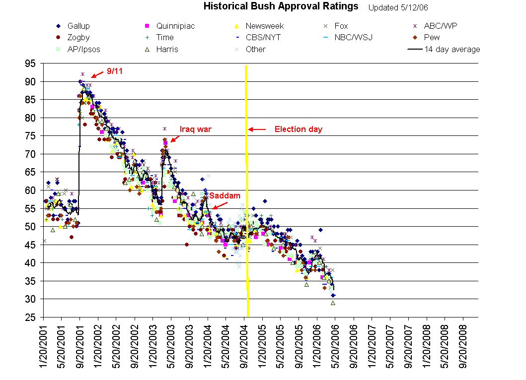
Steve Ruggles at University of Minnesota has prepared a lovely historical chart of Bush’s approval rating over time, as reported by a variety of sources. There’s a pretty clear trend here. Cynical Chris wishes he could believe that this represents a rejection of the policies of the administration by the public, and not irritation at gas prices…
(I’ve captured a snapshot of the graph today, just in case.)
